Hey everyone! I know that there may be some haters out there for Pottery Barn. I just don't happen to be one of them. Surprised?? Well.... the reason I love Pottery Barn and especially Pottery Barn Kids is the accessibility for everyone. I know that some things can be on the pricey side for a lot of people but you can wait for it to go on sale (which I do) or you can use their design sense for inspiration. I am the type of person that feels that you should decorate YOUR house with YOU in mind. I am SO NOT interested in people who are self important imposing what THEY think how your house should look. I'm not the "it's my way or the highway" kind of gal. I really like working with people to bring the best of THEM out in their HOME.
I think that's why I like Pottery Barn in general- you can buy a pillow or a glass or a whole new bedroom. I mean, what they are selling isn't product (well they do) but instead they are selling a LIFESTYLE. And for the most part I think that lifestyle is appealing and accessible to a lot of people. And that lifestyle can be integrated into a lot of people's homes.
I think Pottery Barn Kids is such a great resource for inspiration. Have you seen the new Spring 2012 online catalogue? I just love all the colours. They really know how to put it together. They are such Happy Spaces! A little pricey for some stuff? -wait for a sale. Take what they have presented and make it your own.
What I also like is how they have presented. They even give you the paint colours. Because you know how you (and me) love to know what a particular room is painted in a pretty photo!! But you have to always remember- GET THAT PAINT TESTER! Just because it looks awesome in that photo does not mean that is how it will look in your room. I have said it before and I will say it again-LIGHTING CHANGES EVERYTHING!!! Like I have said before due to the orientation of my house and the porch overhang- paint in my house tends to go green or gray! Very frustrating but I know this so I work with it!
Anyways........Here are just a few of my fav's from Spring 2012 Pottery Barn's Catalogue:

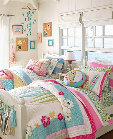
How great are these colours together. All that pink and bright blue. It is definitely a girls room without being too "girly". And the great thing is that this room will grow with her. I tried to find out the paint colour used- I think it is B/M Sapphireberry 2063-60. Such a great bright blue without blowing you away with it's blueness!!!


How amazing is this nursery?? I would love to have this translated into a room for me! I have always loved Chocolate and pink together-there is just something so yummy about it. And the way they have done it here is amazing! This is the type of room that any girl could grow up in. It isn't babyish at all yet is still playful and full of fun. I love the stencil they have applied to the walls. Wainscoting always lends an air of sophistication to any room. The paint colour for this room is B/M Middlebury Brown.


I adore this nursery. It is fun, it's dynamic and it's down right on trend. But that being said I don't think it is too trendy. I LOVE that area rug- I have always been partial to zigzags anyways! My only disagreement with this room is the golden grass cloth above the wainscoting- personally I would have put the same colour gray that is in the rug- but that's just me! I don't have issue with the grass cloth- just the colour. The paint colour for this room is B/M 785 Morning Glory. It is so lovely in this space- it just has an amazing glow and feel about it.


This Room- I LOVE!! Red and Brown- is a great combination. How often do you see Red on the ceiling and with bead board no less?? Sign me up! This room is fun and inviting. All that bead board!! The wall colour is B/M CC-20 Decorators White and the Red for the ceiling is 1322 Ladybug Red. Don't you just love the name of that red?? So cute!!


This is such a great example of how to cram a bunch of kids into a room and still make it look great. High wainscoting is always a winner in my books and it looks great here-especially with that great blue above it. And it' such a great way to showcase family pictures as well on that great plate rail. The blue used here is B/M 2064-10 Bold Blue. It really is a great deep blue. And it looks fabulous against all that white- probably Decorator's White- just a guess! But I think they tend to be consistent with their paint choice when it comes to panelling.

Even though the wall colour is white- could be Decorators White?? But whatever the white is it allows the colours in the bedding and the matting of the frames to really pop. Such a bright room to be in!!

The combination of Pink, Yellow and Gray is so beautiful. It is such a great colour combo. I wish they had listed what gray they have used. It is so hard for me to pick one because of the lighting in the room and my monitor..... And it is hard to get a really great look at it. But it definitely isn't a gray with a green undertone to it. Or one with a pink undertone.

This is the type of room any little man can grow up in. I am such a sucker for gingham. And I love gingham on the walls. It adds so much interest to a room. Red, White and Blue is always a great combo for a boys room.
 Again Red, White and Blue are used here- but in a very different way. They have chosen to place a light blue over red- different and interesting! Again this is the type of room that can grow with any little man. And it's the type that YOU can put your own stamp on it.
I could probably put many, many more rooms but wanted to share a few rooms of inspiration if your budget doesn't allow you to buy it as is. Because lets face it- a lot of us have to take these pics and use them for inspiration- and I know we do.
Have a great day everyone.
Megan
I think that's why I like Pottery Barn in general- you can buy a pillow or a glass or a whole new bedroom. I mean, what they are selling isn't product (well they do) but instead they are selling a LIFESTYLE. And for the most part I think that lifestyle is appealing and accessible to a lot of people. And that lifestyle can be integrated into a lot of people's homes.
I think Pottery Barn Kids is such a great resource for inspiration. Have you seen the new Spring 2012 online catalogue? I just love all the colours. They really know how to put it together. They are such Happy Spaces! A little pricey for some stuff? -wait for a sale. Take what they have presented and make it your own.
What I also like is how they have presented. They even give you the paint colours. Because you know how you (and me) love to know what a particular room is painted in a pretty photo!! But you have to always remember- GET THAT PAINT TESTER! Just because it looks awesome in that photo does not mean that is how it will look in your room. I have said it before and I will say it again-LIGHTING CHANGES EVERYTHING!!! Like I have said before due to the orientation of my house and the porch overhang- paint in my house tends to go green or gray! Very frustrating but I know this so I work with it!
Anyways........Here are just a few of my fav's from Spring 2012 Pottery Barn's Catalogue:


I adore this nursery. It is fun, it's dynamic and it's down right on trend. But that being said I don't think it is too trendy. I LOVE that area rug- I have always been partial to zigzags anyways! My only disagreement with this room is the golden grass cloth above the wainscoting- personally I would have put the same colour gray that is in the rug- but that's just me! I don't have issue with the grass cloth- just the colour. The paint colour for this room is B/M 785 Morning Glory. It is so lovely in this space- it just has an amazing glow and feel about it.


This Room- I LOVE!! Red and Brown- is a great combination. How often do you see Red on the ceiling and with bead board no less?? Sign me up! This room is fun and inviting. All that bead board!! The wall colour is B/M CC-20 Decorators White and the Red for the ceiling is 1322 Ladybug Red. Don't you just love the name of that red?? So cute!!


This is such a great example of how to cram a bunch of kids into a room and still make it look great. High wainscoting is always a winner in my books and it looks great here-especially with that great blue above it. And it' such a great way to showcase family pictures as well on that great plate rail. The blue used here is B/M 2064-10 Bold Blue. It really is a great deep blue. And it looks fabulous against all that white- probably Decorator's White- just a guess! But I think they tend to be consistent with their paint choice when it comes to panelling.


Even though the wall colour is white- could be Decorators White?? But whatever the white is it allows the colours in the bedding and the matting of the frames to really pop. Such a bright room to be in!!

The combination of Pink, Yellow and Gray is so beautiful. It is such a great colour combo. I wish they had listed what gray they have used. It is so hard for me to pick one because of the lighting in the room and my monitor..... And it is hard to get a really great look at it. But it definitely isn't a gray with a green undertone to it. Or one with a pink undertone.


I could probably put many, many more rooms but wanted to share a few rooms of inspiration if your budget doesn't allow you to buy it as is. Because lets face it- a lot of us have to take these pics and use them for inspiration- and I know we do.
Have a great day everyone.
Megan
No comments:
Post a Comment